
🔗 Integrations for All: Redesigning the Pendo Integrations Experience
When I joined Pendo as Design Lead for Enterprise, I hit the ground running and was a part of two teams right out of the gate. The first team was responsible for adding granular roles and permissions in the application. The second team was responsible for APIs and integrations. This small, scrappy squad, Team Tapioca, quickly became my favorite team – Amazing teammates, brilliant problem solvers, and fun people to work with and see everyday.
Challenges
The integrations redesign presented a few large challenges and opportunities:
-
Integrations were only viewable by admin users.
-
As a part of scaling for the enterprise, it would be more common for external products to have multiple types of integrations for the product. For example, a company like Zendesk may have an integration for NPS as well as a chat client for our Resource Center module. In our existing design, this would show 2 separate Zendesk cards. No big deal – it was simply cluttered.
-
Research showed that users experienced frustration in a few areas:
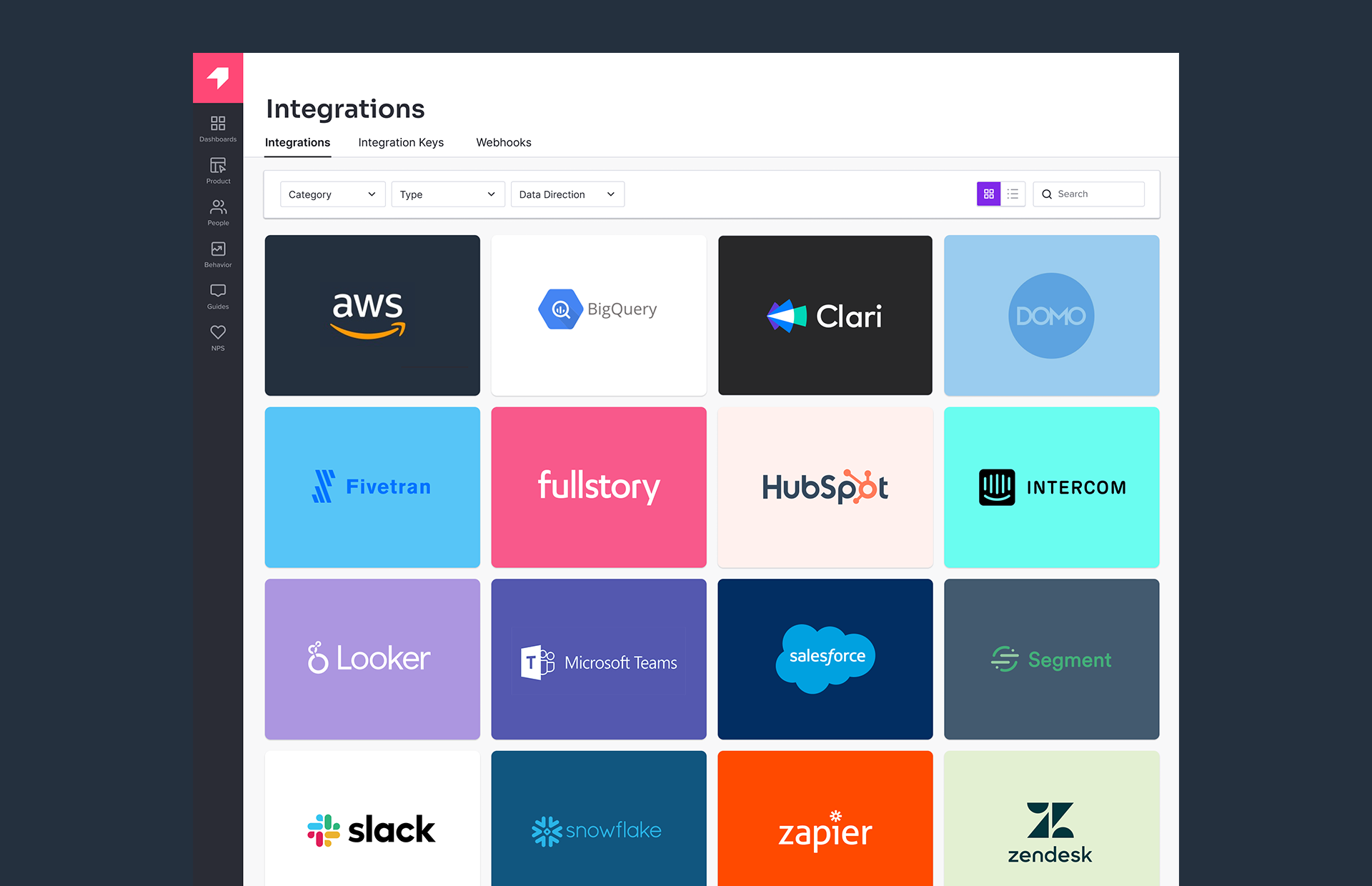
- Discovery: The current experience required multiple integrations for one product to have separate overviews. This meant that products like Zendesk would have 2 Zendesk cards on our integrations page. This created visual clutter. The page was organized by type, with no sorting or filtering. It required a lot of scrolling and when users don't know what they are looking for, this made the experience difficult and uninspiring.
- Features: Learning about our integrations required users to leave the product and visit our Knowledge Base, which was not always currently aligned with our latest offerings. The Knowledge Base is an excellent resource, but our team knew there was a better way to help customers learn about everything! In-app education was a spin-off initiative that I really enjoyed concepting with my teammates and this project was ripe for getting a POC in the hands of customers. When I had to describe this work to anyone, I would say "show and tell wherever possible." Not all users work in the command line.
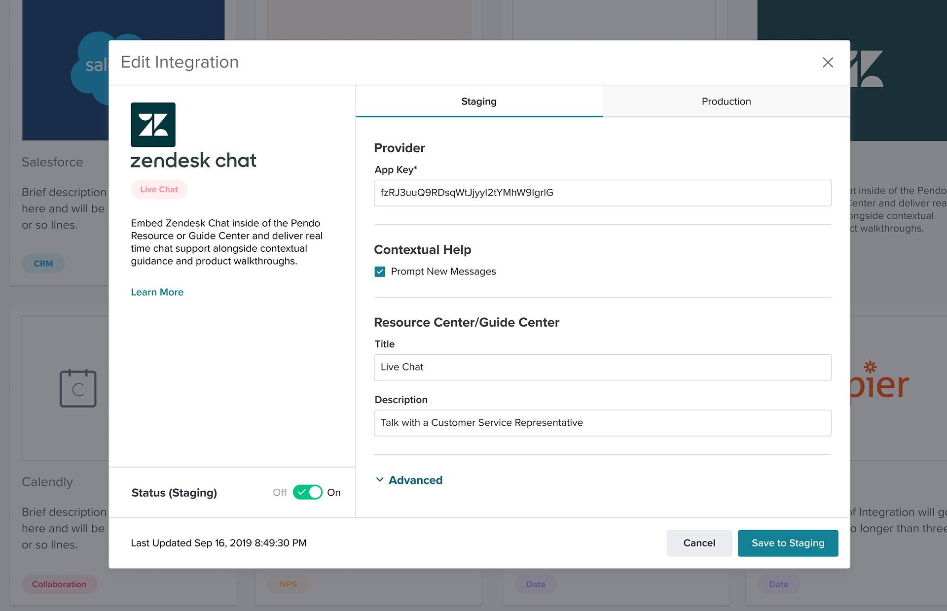
- Setup & Installation: In many cases, setup was a pain point. Users may be able to install in a single click, but sometimes they would have to contact support or navigate to another page in the product, like Data Mappings. This caused confusion and sometimes, frustration.
- Status: Error states were inconsistent and sometimes difficult to find. Customers I spoke with wanted a single place to do the work and see what was working and what wasn't.
- Migration: One of the biggest issues we consistently encountered moving Design forward was being in a transition from Angular to Vue. This would result in modals and installation widgets having a variety of appearances and insconsistent behaviors, often beyond the scope of our immediate sprint goals.
Act Like Owners: When the first solution isn't good enough, but you really believe in the idea, you must keep it alive
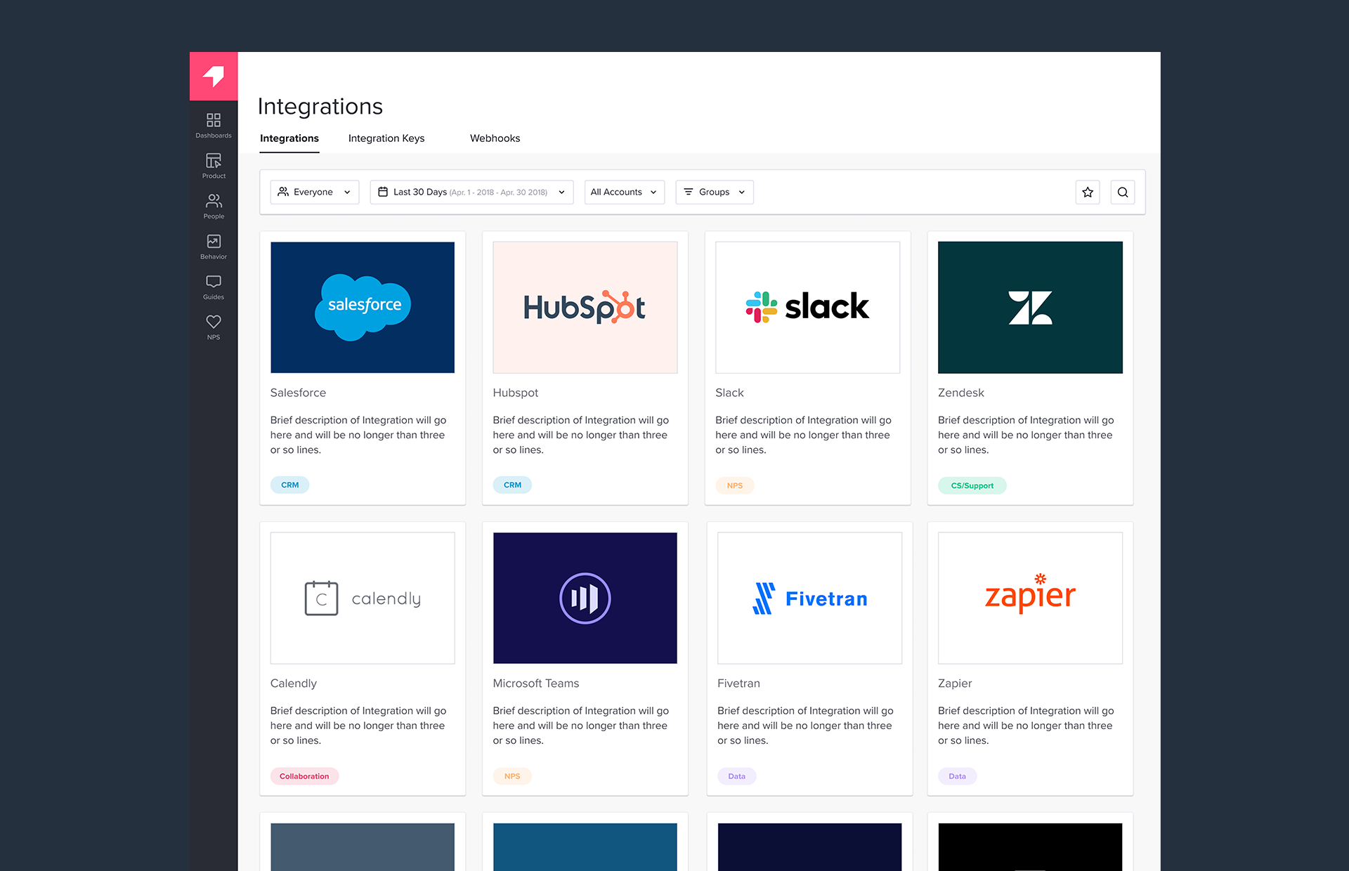
There were a few iterations of the experience, and it began with subtle improvements to the existing UI. The first iteration was a basic visual cleanup and the addition of brief overviews. Integrations were organized into cards with brief descriptions of each addition and relevant tags. This concept included updated tags to better reflect our categories: Installed/Active, BI, CRM, CS/Support, Chat, Collaboration, Connector, Data, Feedback, Knowledge Base, and Product Tools. In user testing, these categories received good feedback, but it was still very difficult to discover without being able to sort and filter by these categories at the top of the page. This was an issue with the need to migrate to Vue.
👆 The first iteration Visual Cleanup and the addition of brief descriptions (Angular)
👆 The second iteration Cleanup of installation modals (Angular)
RIP 🪦
This concept was partially implemented. Modals were enhanced, but the overall experience was not realized. Momentum faded. Other priorities surfaced on our team. I worried the idea was dead. Working in my spare time, I kept it alive as a passion project and designed a ton of concepts over the next few quarters. Many days, if I needed some inspiration, I would design integration cards and ideas for the page because I enjoyed it. I did not think it would come back to life, but I've learned that it's always good to keep the ideas because at some point, it will happen...and in early 2022, it did.
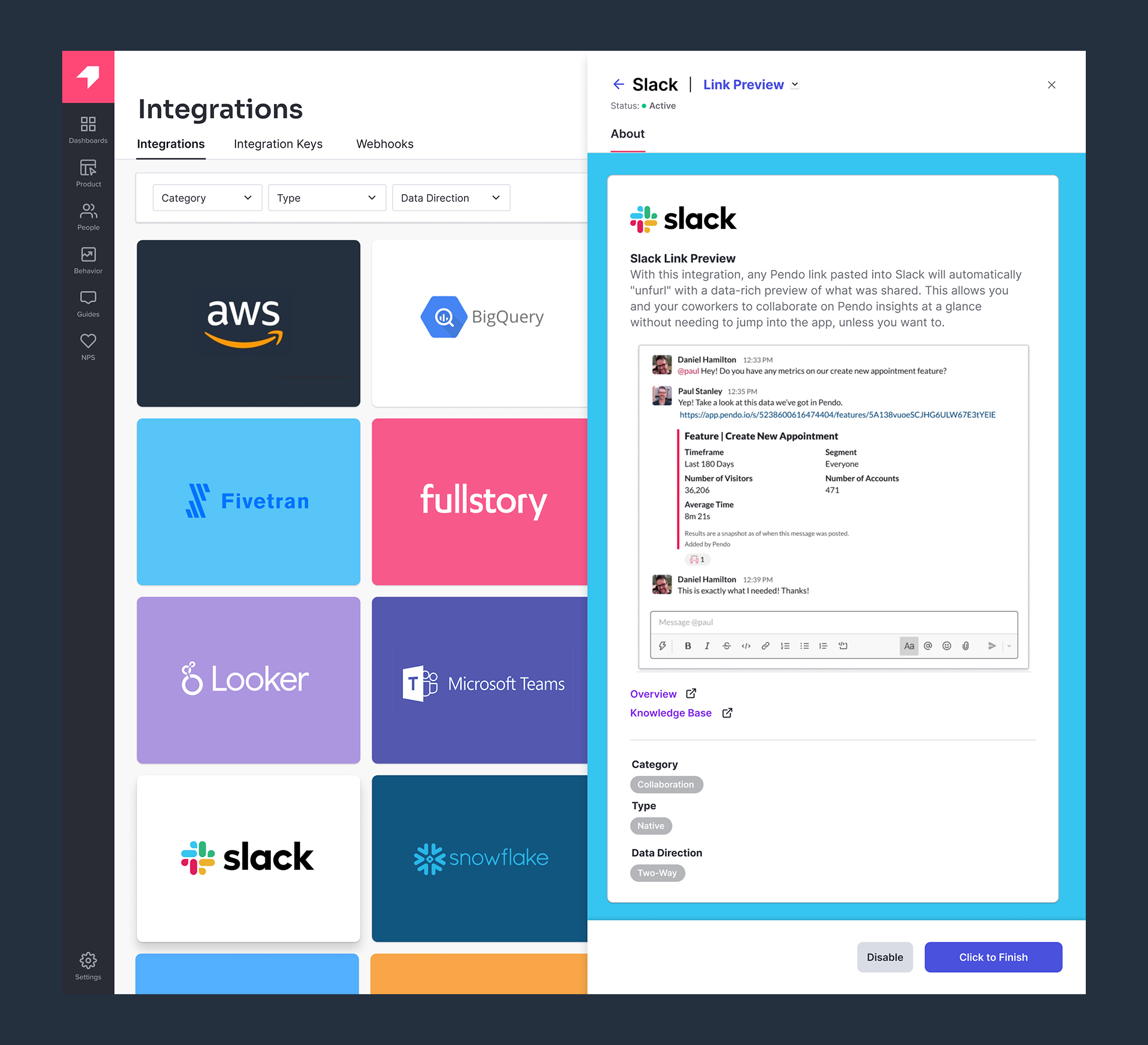
Rethinking the Modal, Addressing the Pain Points
One of the ideas that I explored really seemed to stick. It involved making use of some new directions we were exploring with our design patterns, specifically with using our drawers and blades (slide-out panels) to provide customers with more detailed views of their analytics. I had some ideas around creating a structure for the integrations that could address all of our customer pain points. I diagrammed this for the team.
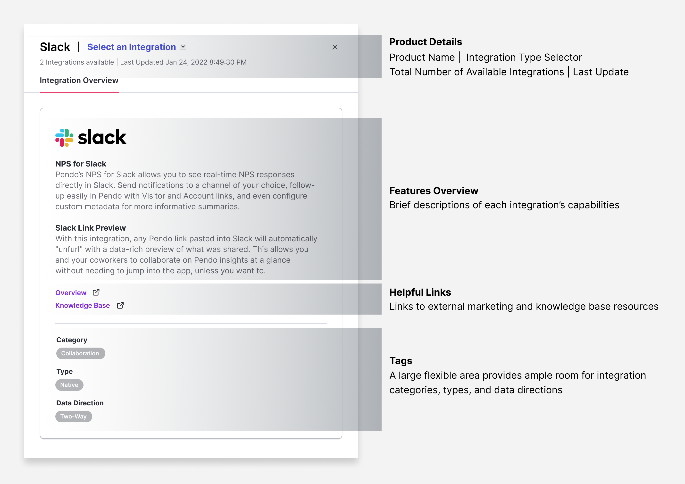
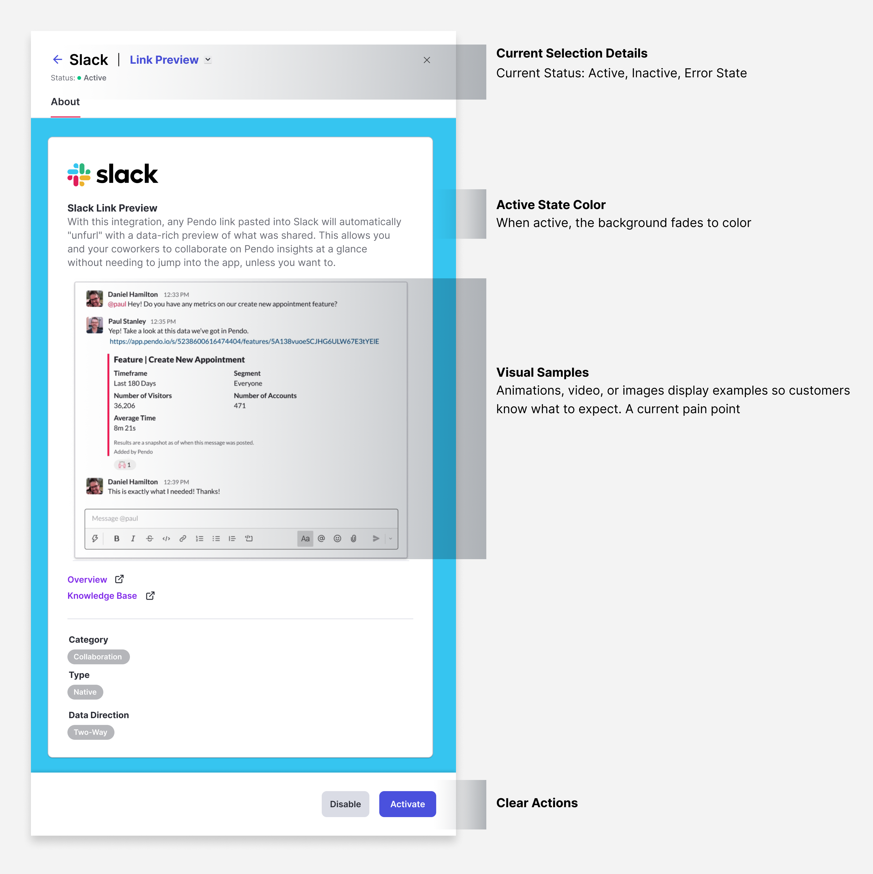
👆 Anatomy of a Drawer Diagram showing the breakdown of information required for every integration
User Testing & High Marks
👆 Wakey Wakey: Animation demonstrating one of the flows in the user test. Turn it on, wake it up!
As of May 2022, my concept received the highest usability score (78.5) of any test that had been performed at Pendo. Here's a Slack message from one of our User Researchers on the team:
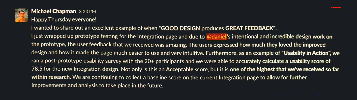
Happy Thursday everyone! I wanted to share out an excellent example of when "GOOD DESIGN produces GREAT FEEDBACK". I just wrapped up prototype testing for the Integration page and due to @daniel's intentional and incredible design work on the prototype, the user feedback that we received was amazing. The users expressed how much they loved the improved design and how it made the page much easier to use and very intuitive. Furthermore, as an example of "Usability in Action", we ran a post-prototype usability survey with the 20+ participants and we were able to accurately calculate a usability score of 78.5 for the new Integration design. Not only is this an Acceptable score, but it is one of the highest that we've received so far within research. We are continuing to collect a baseline score on the current Integration page to allow for further improvements and analysis to take place in the future.
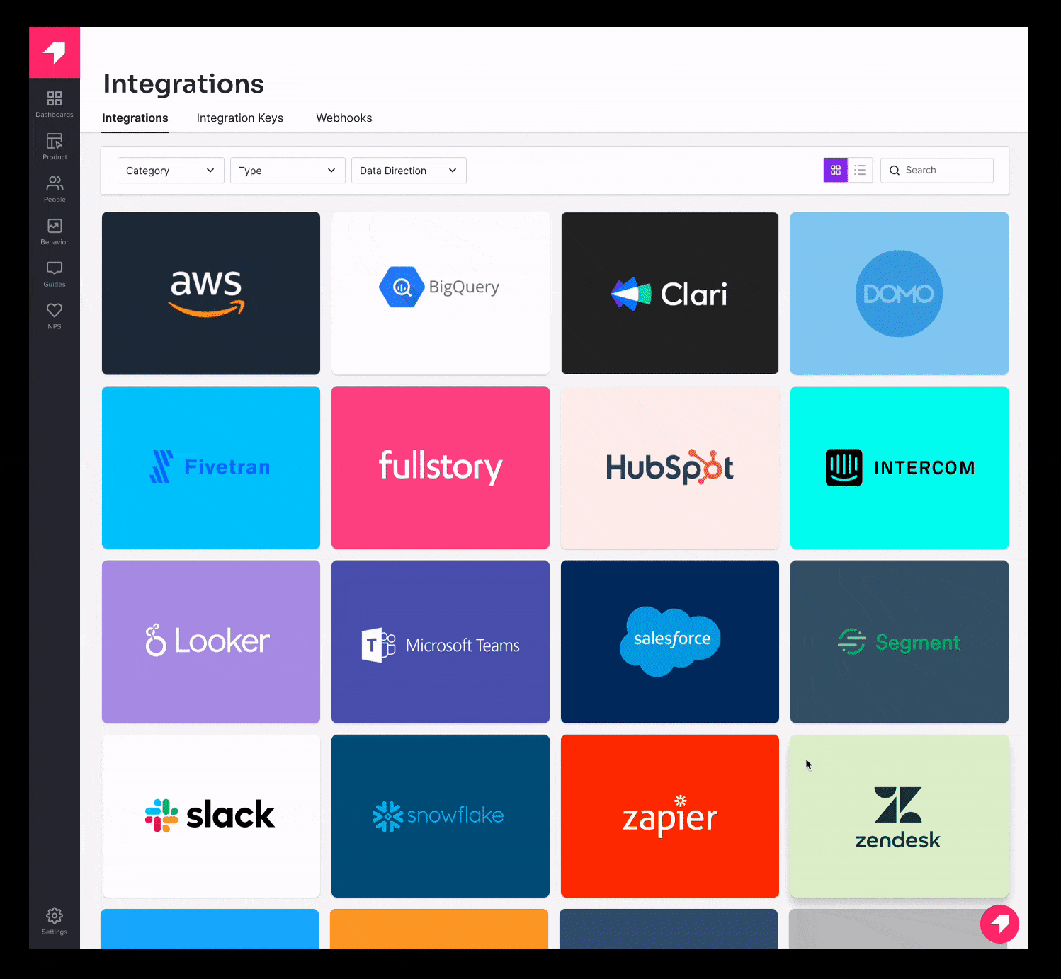
👆 Card View
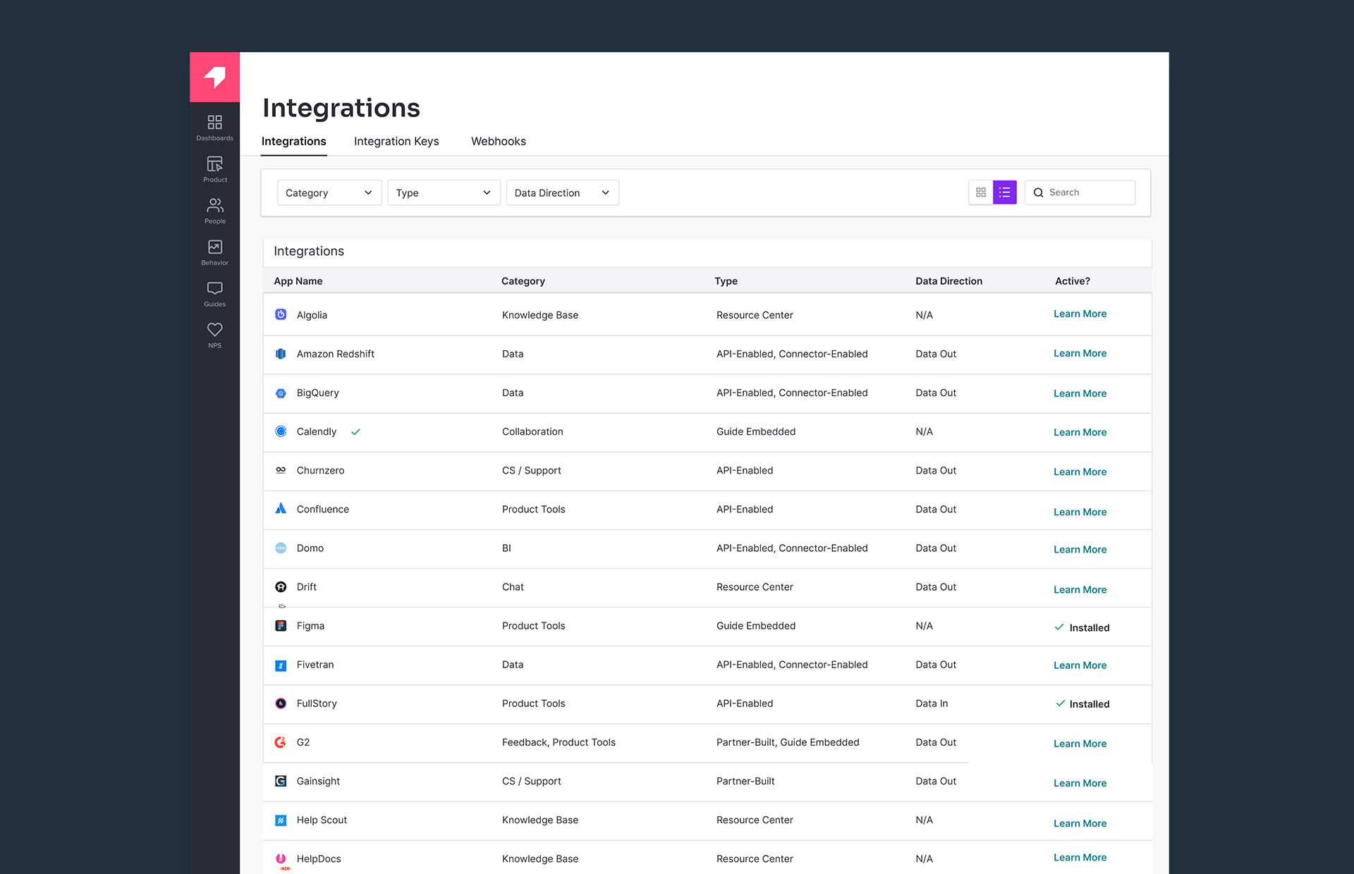
👆 List View
👆 Drawer & Installation Detail